Analysis of Magazine Advert:
Magazine adverts can be extremely beneficial for both the artists as well as
the release of the new song or album, creating a connection between the artist
and their product allowing the audience to understand their individuality and
characteristics further.

From this Album advert found with in a magazine we are able to develop an
understanding of the artist herself, as well as the music that she produces.
The typography used being bold and fancy indicates Katy Perry to be girly, or quite feminine while still cheeky and outgoing. The bold, and almost bouncy writing is suggestive of her excitement and joy as an individual, creating a childish and energetic persona for herself. The red colour choice enables Katy to represent her feminine aspects whilst also portraying some form of attitude or independence as an individual. The simple typography at the bottom of the poster stating the artists social media platfroms acts as a method for her to be able to advertise her music to a much larger audience of indiviudals.
The use of pastel colours mixed with the 40's 'pin up girl' style creates a contrast between innocence and purity and the more voyeuristic and sexual aspect. The pin up girl style was a method of dressing and posing in a sexual manner, while still remaining relatively covered up and appropriate for all viewers. The red lipstick indicates power or authority allowing the audience to understand her character to be possibly slightly unusual, outgoing, while still being respectful and maintaining some form of innocence. This voyeuristic aspect to the poster will attract the male gaze. The fact she is looking away from camera provides an interesting aspect to the poster, almost making it stand out from other music video posters.
The very simplistic background being pale pink is beneficial to the poster as it allows Katy Perry to stand out to the rest of the poster as well as all other posters within a music magazine, grabbing the audience attention and create a star iconography. Katy Perry is also holding an ice cream, this further portrays her childish attitude, it being enlarged is unusual and over exhaggerative making Katy Perry seem smaller and possibly even representing innocence further, while her pose standing slighly on one hip with her finger to her bright red lips represents her cheeky characteristic with her childlike aura. This balance between childish and brave attitude grabs the attention of the audience and not only links to males becuase of her sensual portrayal but to the younger generation through a hyper and exciting personality.
Overall the colours used and her character that is represented directly target the pop audience.
Overall the colours used and her character that is represented directly target the pop audience.
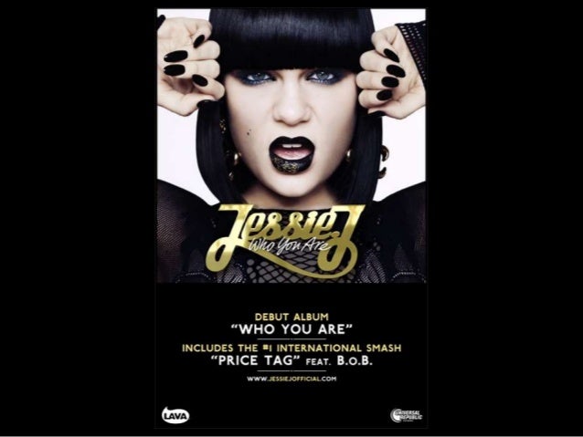
Similarly with Jessie J's magazine poster for her debut album 'Who are you' the colour, camera angles, and typography aid a style that she was aiming to create.
The dark use of colours withing the poster, for example her black nails, hair, eye make-up, and lipstick is suggestive of her strong, powerful and almost threatening personality. Her dark, bold and sharp hair style also suggests her power or even authority allowing her to act as a strong and independent force for her female viewers. The extreme close ups provides an up close and personal look into her individuality, allowing the audience to possibly feel a connection with Jessie J allowing her to begin to create a star iconography.
The contrast between the Black of her costume and makeup, in comparison to the white of the back drop allows the artist to stand out and be represented as the most important and significant individual, further becoming suggestive of power. The typography being printed in a simple metalic gold font causes it to stand out against the dark background, while adding a more feminine twist to the artist. Creating a star iconography and enabling the audience to feel a connection with the artist and therefore possibly feel more obliged to listen to her music.
The use of photo choices and typonography allows the poster to attract the pop genre audience whilst the unusal colour choice being black enables the poster to stand out from those already existing on the market and enable a larger porportion of the target audience to buy and listen to the music made.
The expression on Jessie J's face indicates her power or superiority and bold characteristics further, through the use of little expression and a much bolder and forward look in her eyes.
The way Jessie J and her music is portrayed through the poster allows the audience to understand the darker and more passionate side of the music that the album will consist off. The fact that features are present on the poster will enable any fans of B.o.B to also be interested in the music.
No comments:
Post a Comment